trailpal
Brand identity, UX, UI
Brand identity, UX, UI
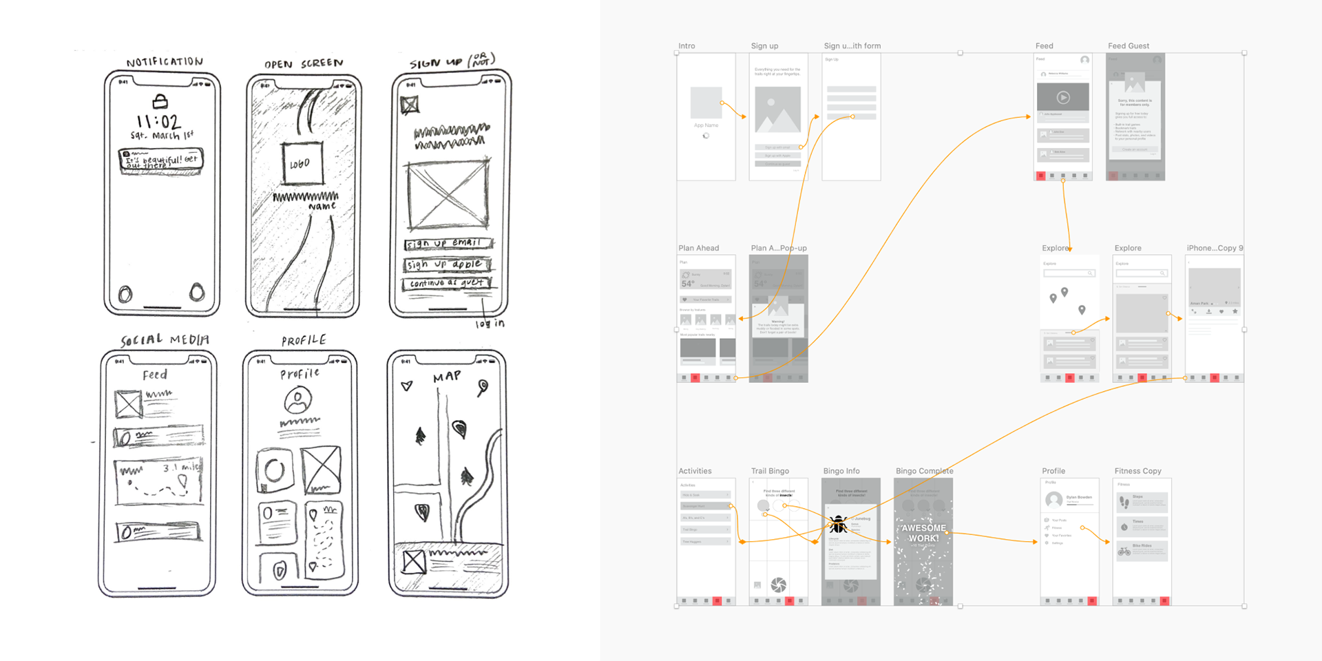
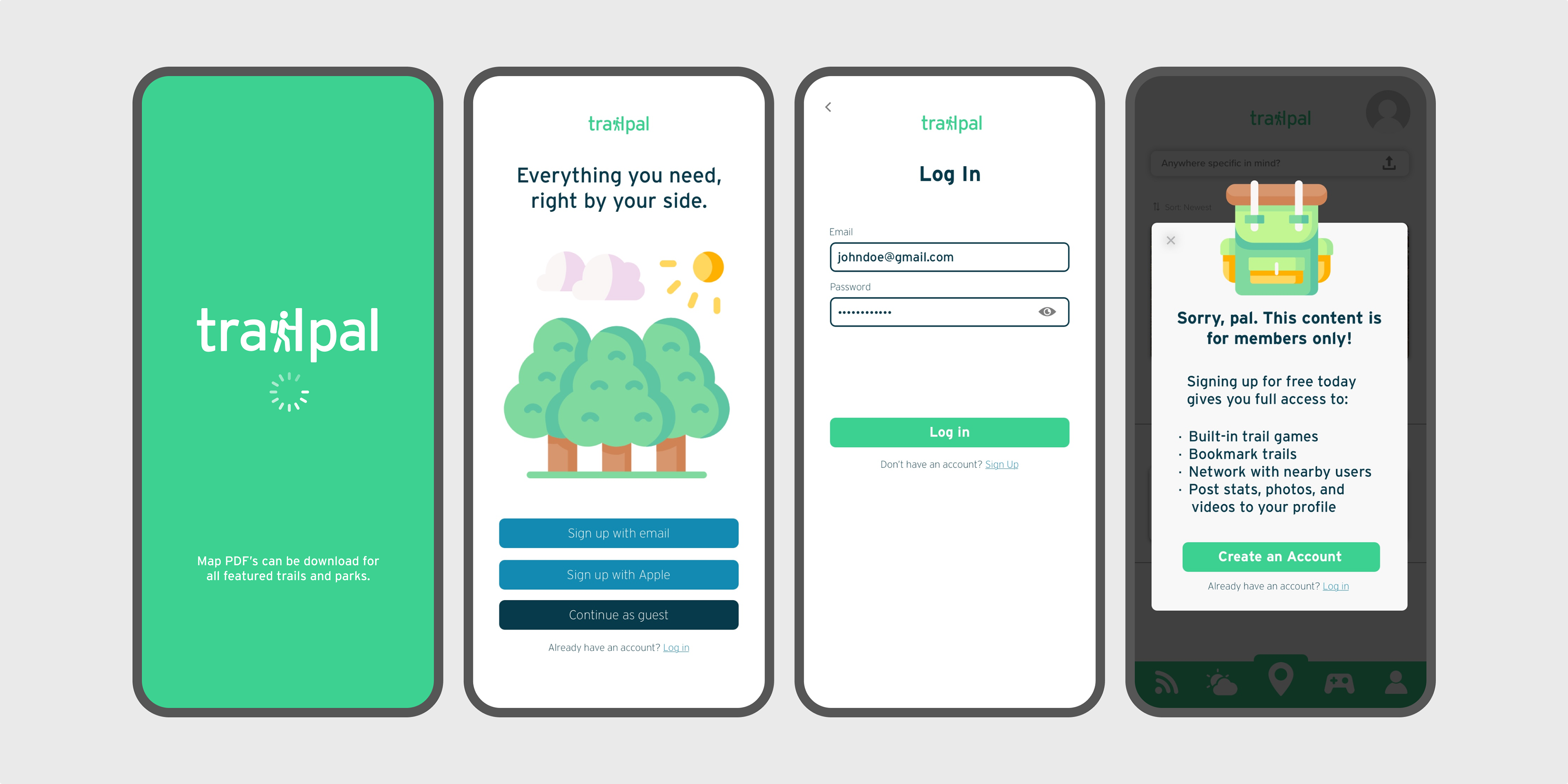
Trailpal is an app allowing families and individuals to easily access and navigate their local parks and trail systems.


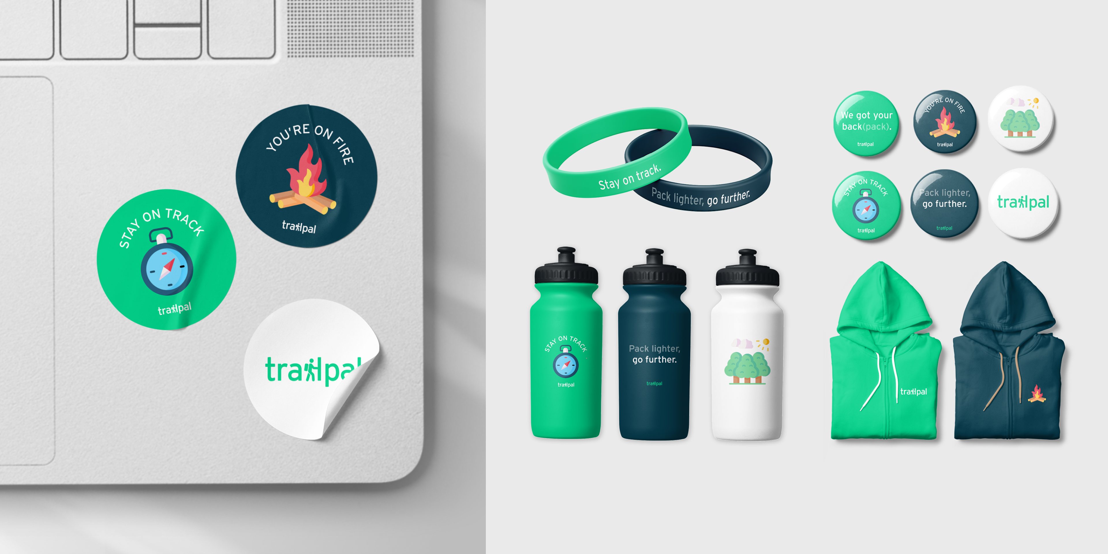
Interstate was chosen as the primary typeface for its optimization in navigation. The primary green comes from highway markers and trailway signs. Playful illustrations and tone of voice emphasize the "pal" in trailpal.
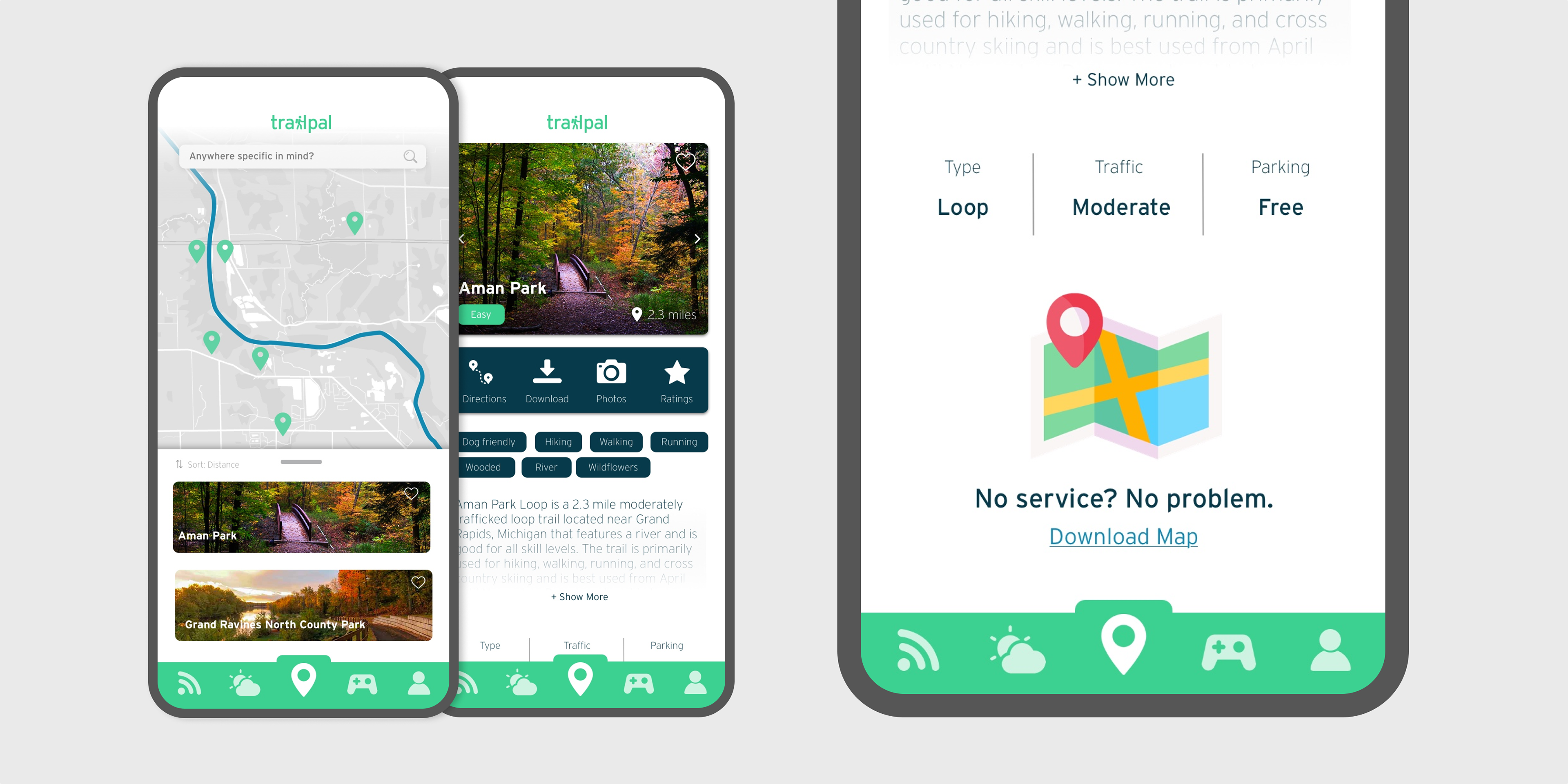
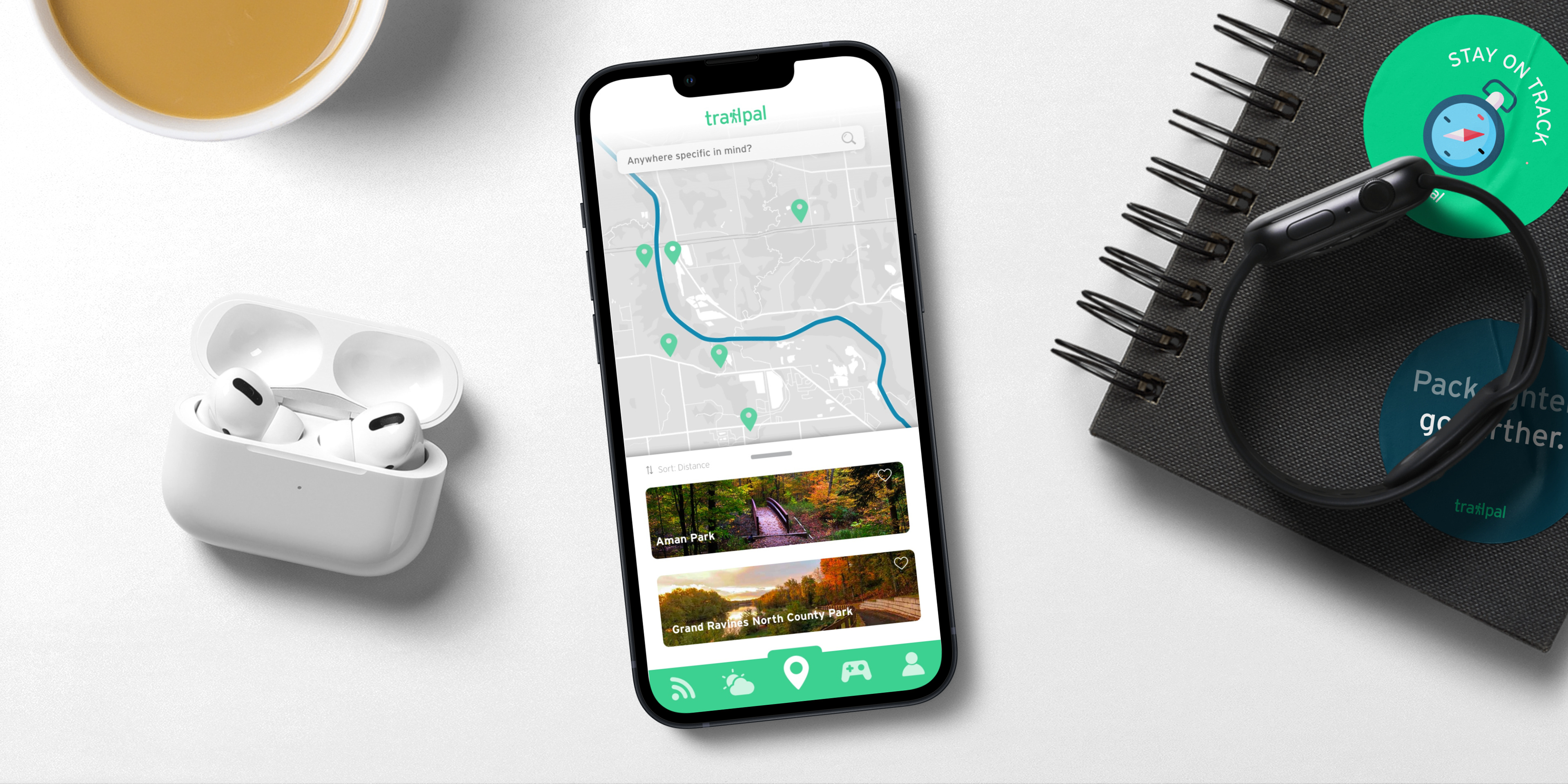
No physical maps were offered at local trails--only those featured on the main sign located at the trailhead. Wayfinding also became confusing, facilitating a need for digital map downloads in the app.
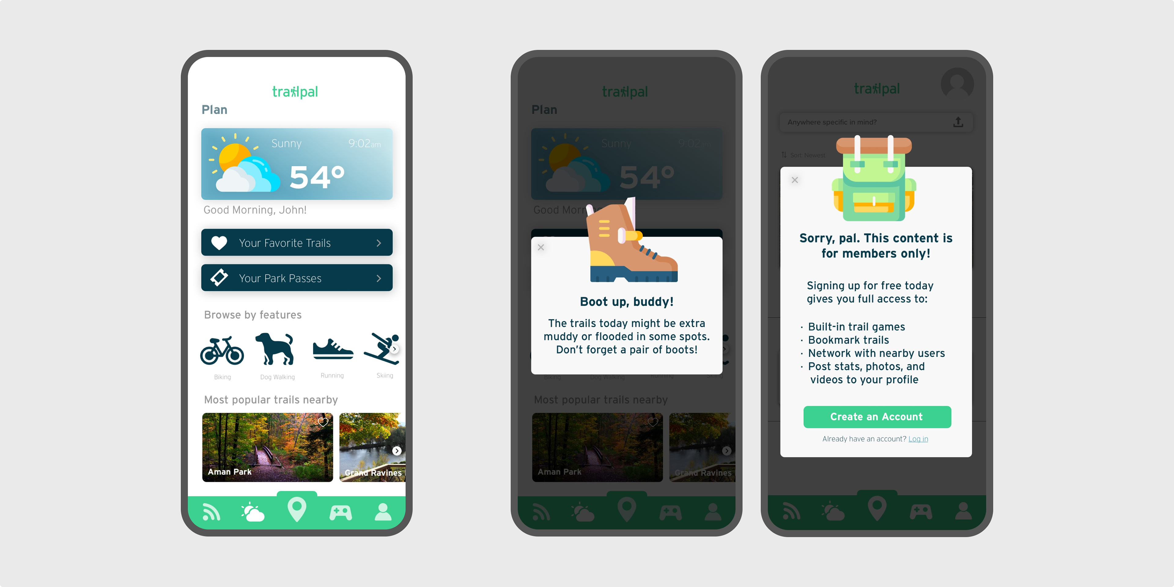
Conditions were often treacherous on the trails. trailpal warns you about these dangers before you head out.
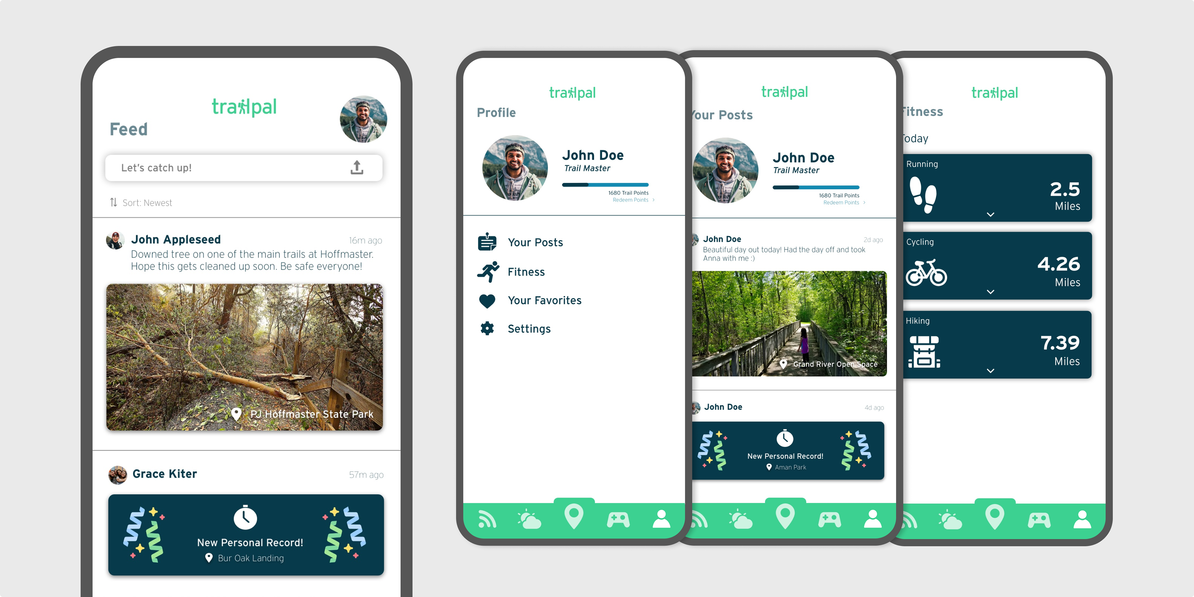
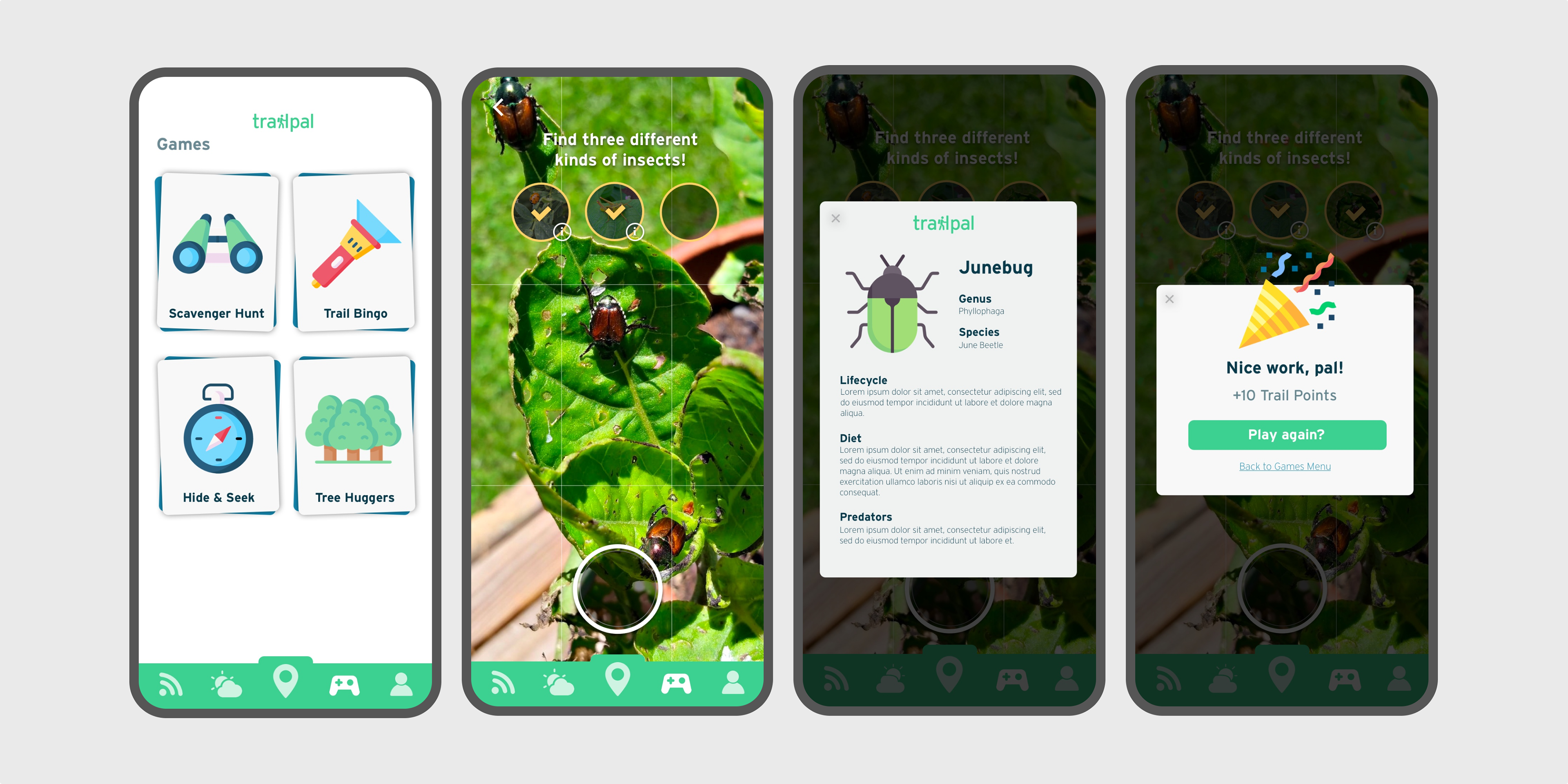
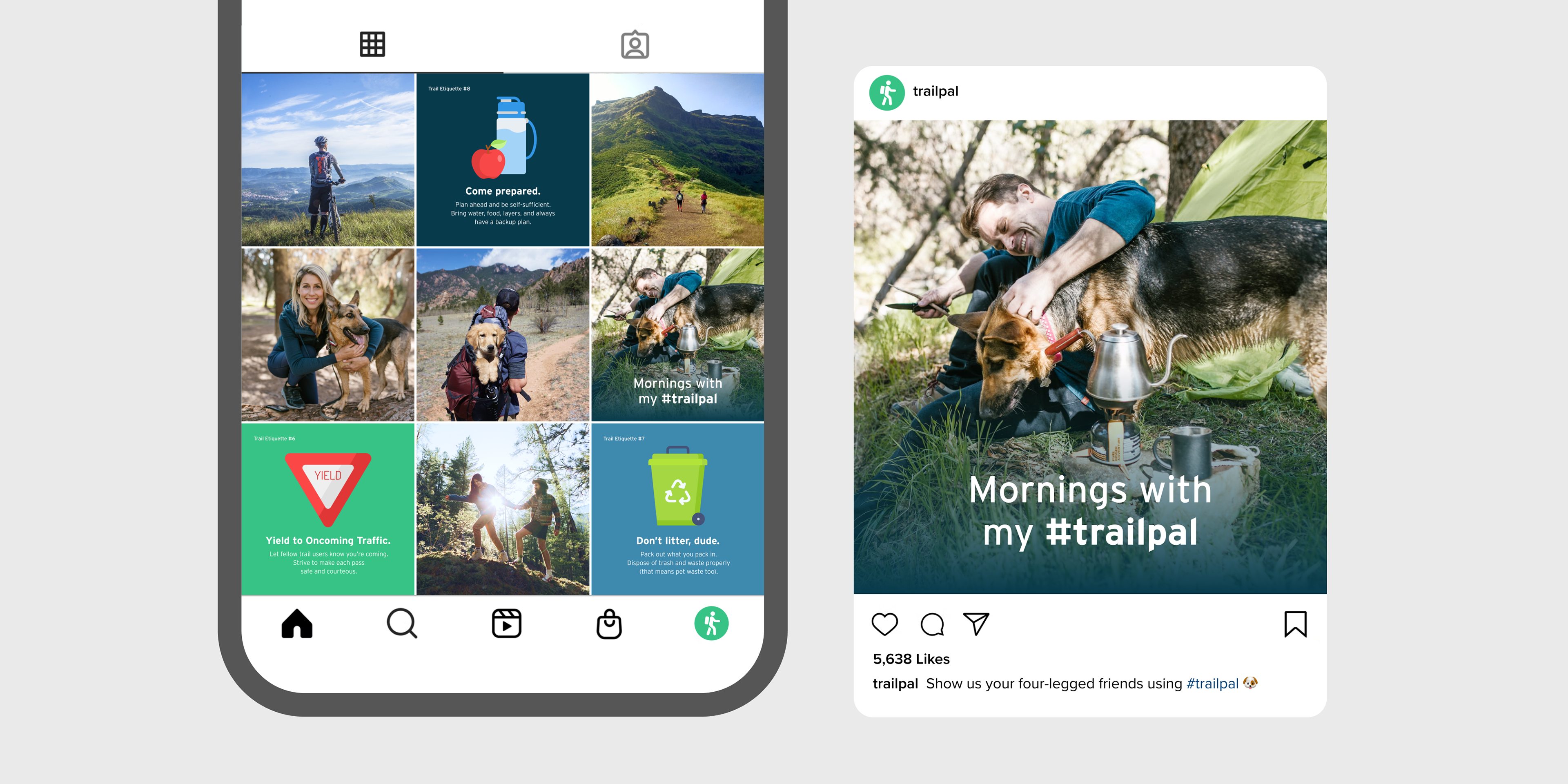
Trails often had small signs identifying flowers and other fauna. This sparked the idea for trail games that immerse all ages while still remaining educational.