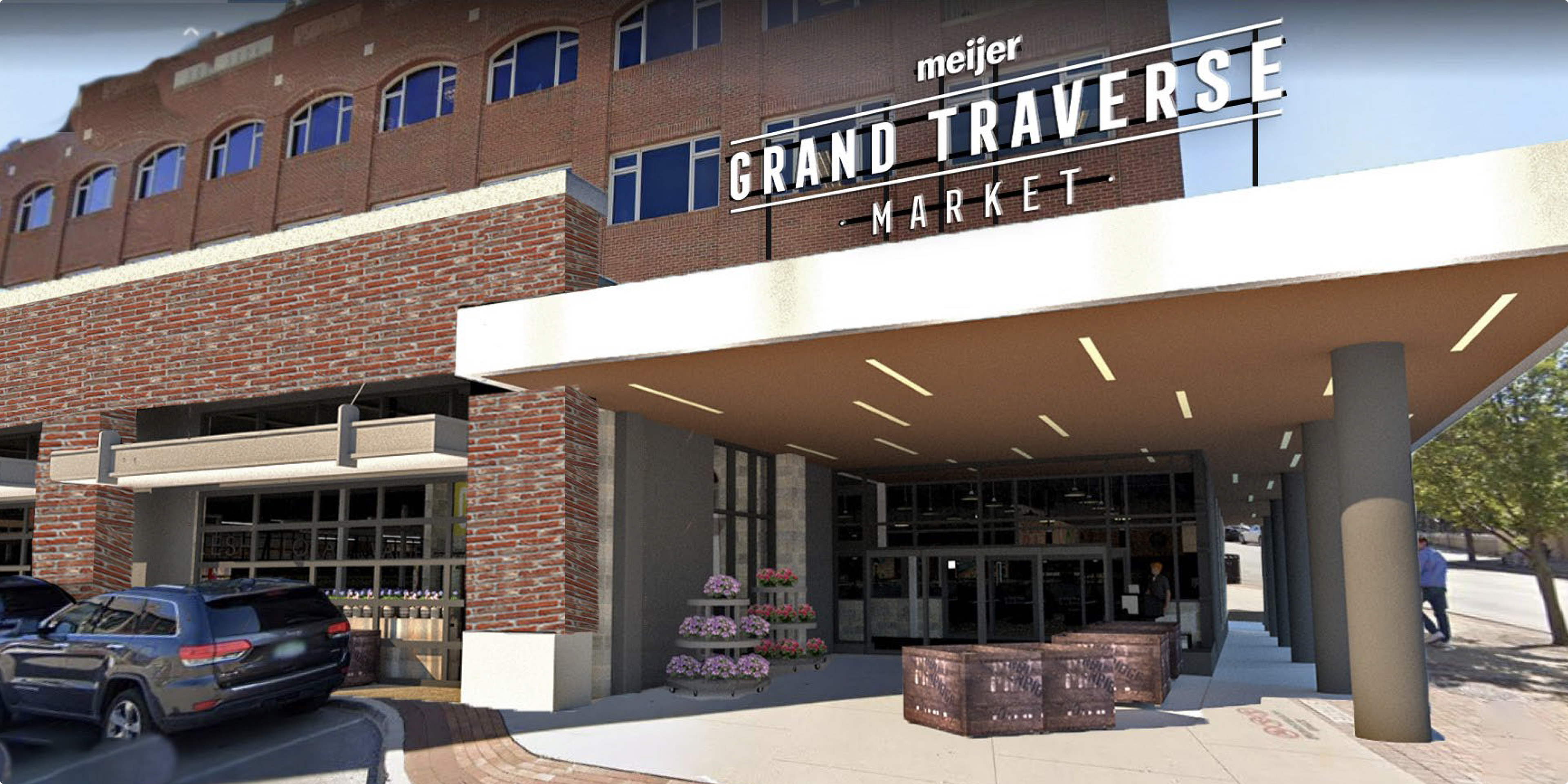
Meijer® Grand Traverse Market
Environmental, Interior
Environmental, Interior
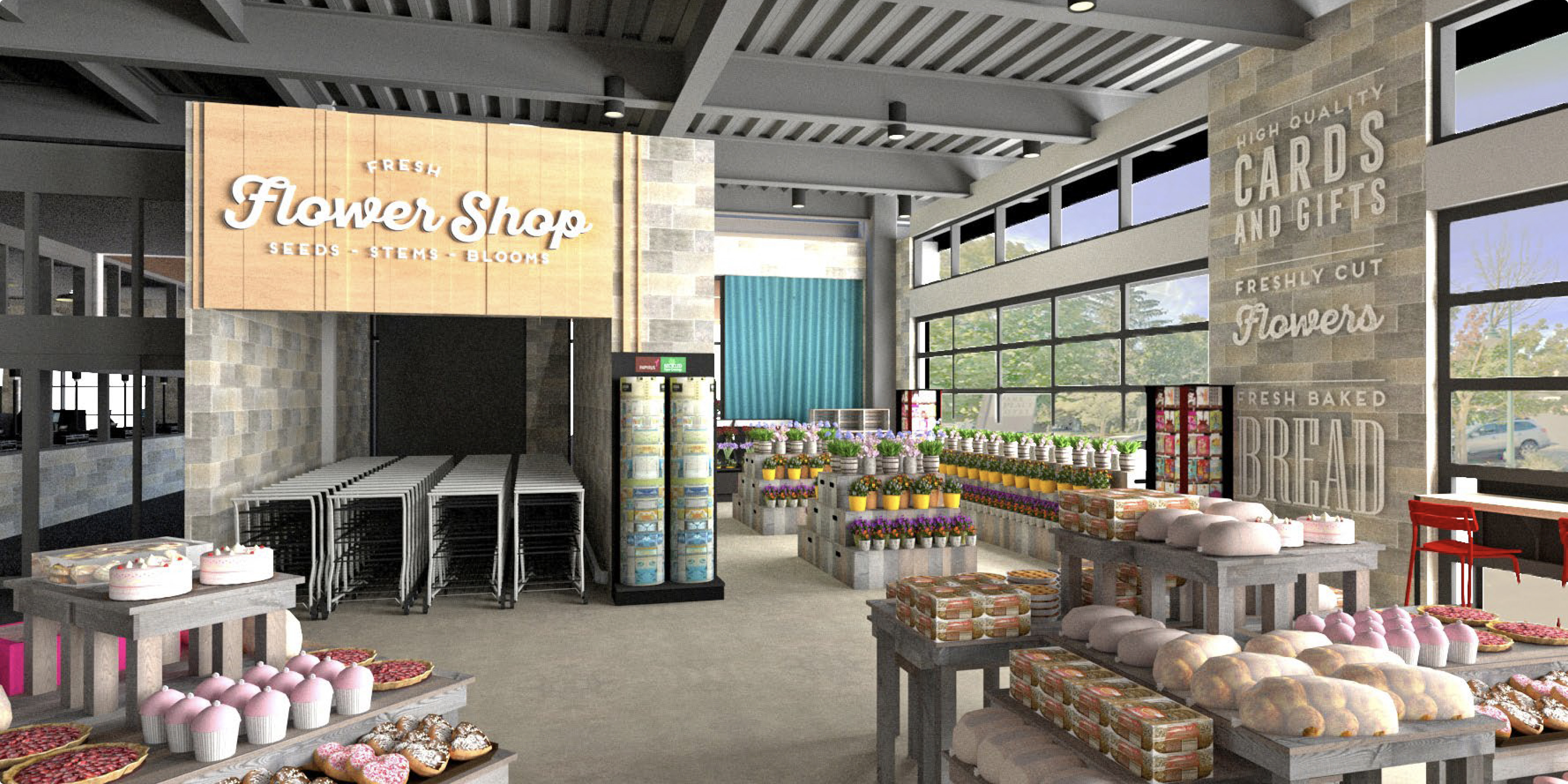
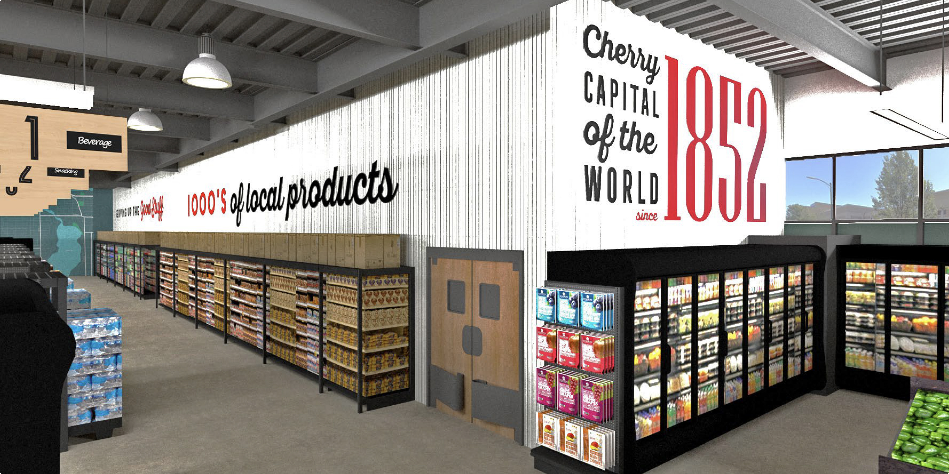
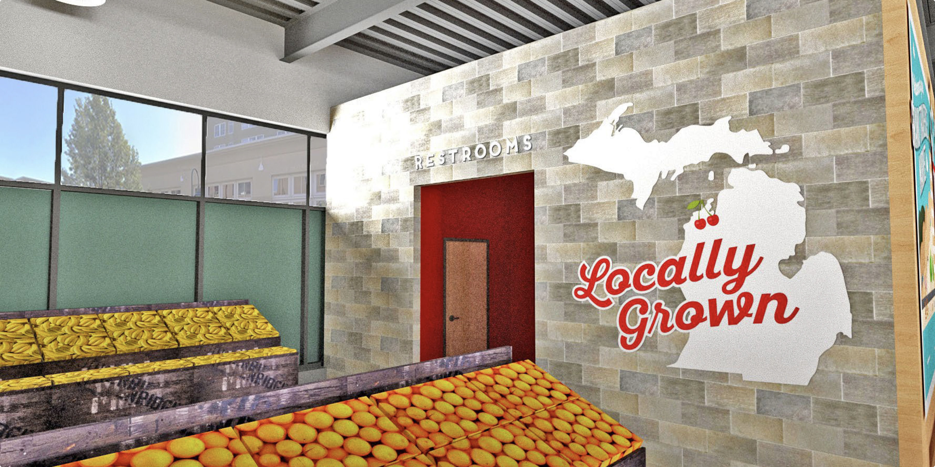
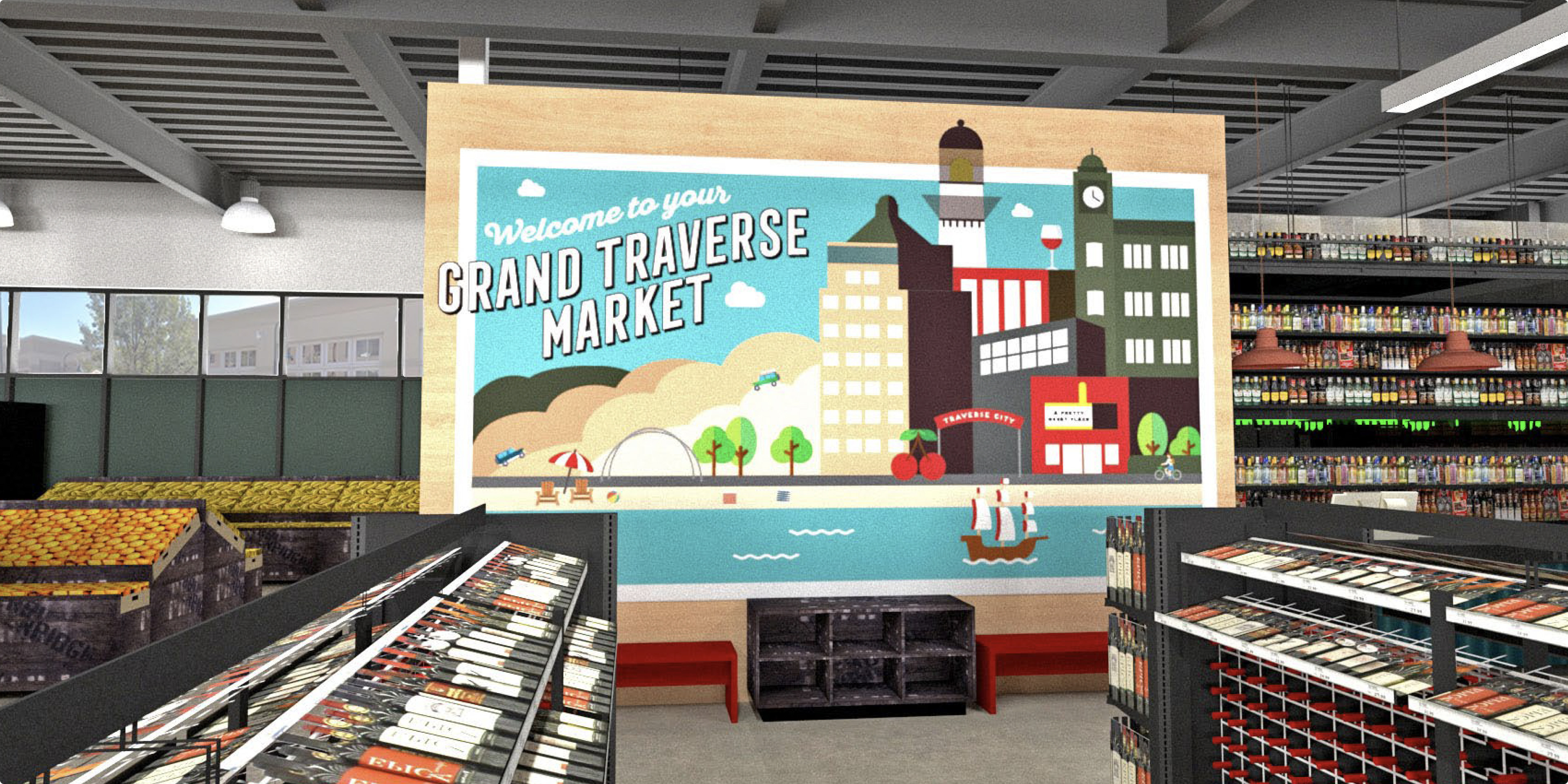
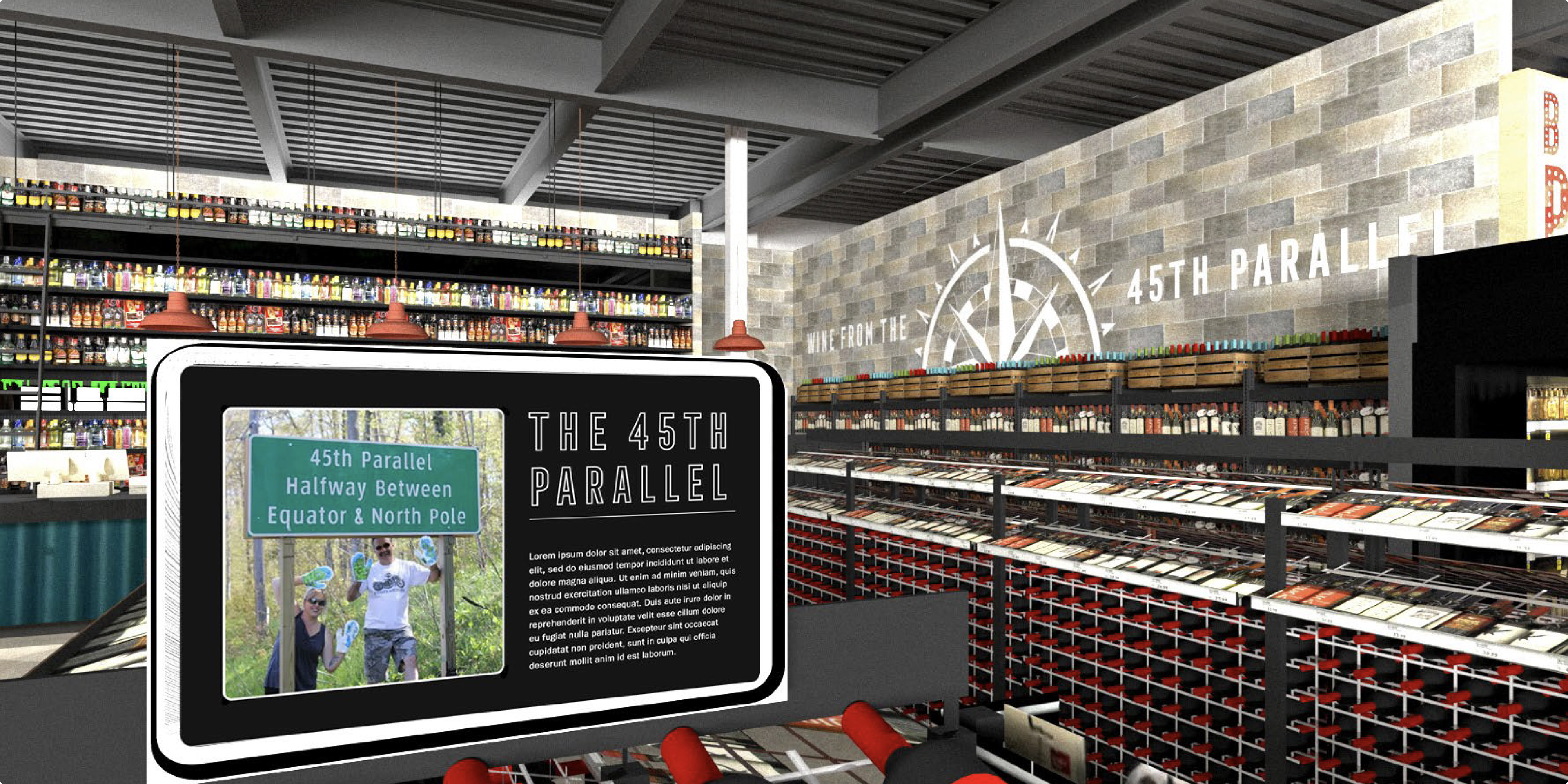
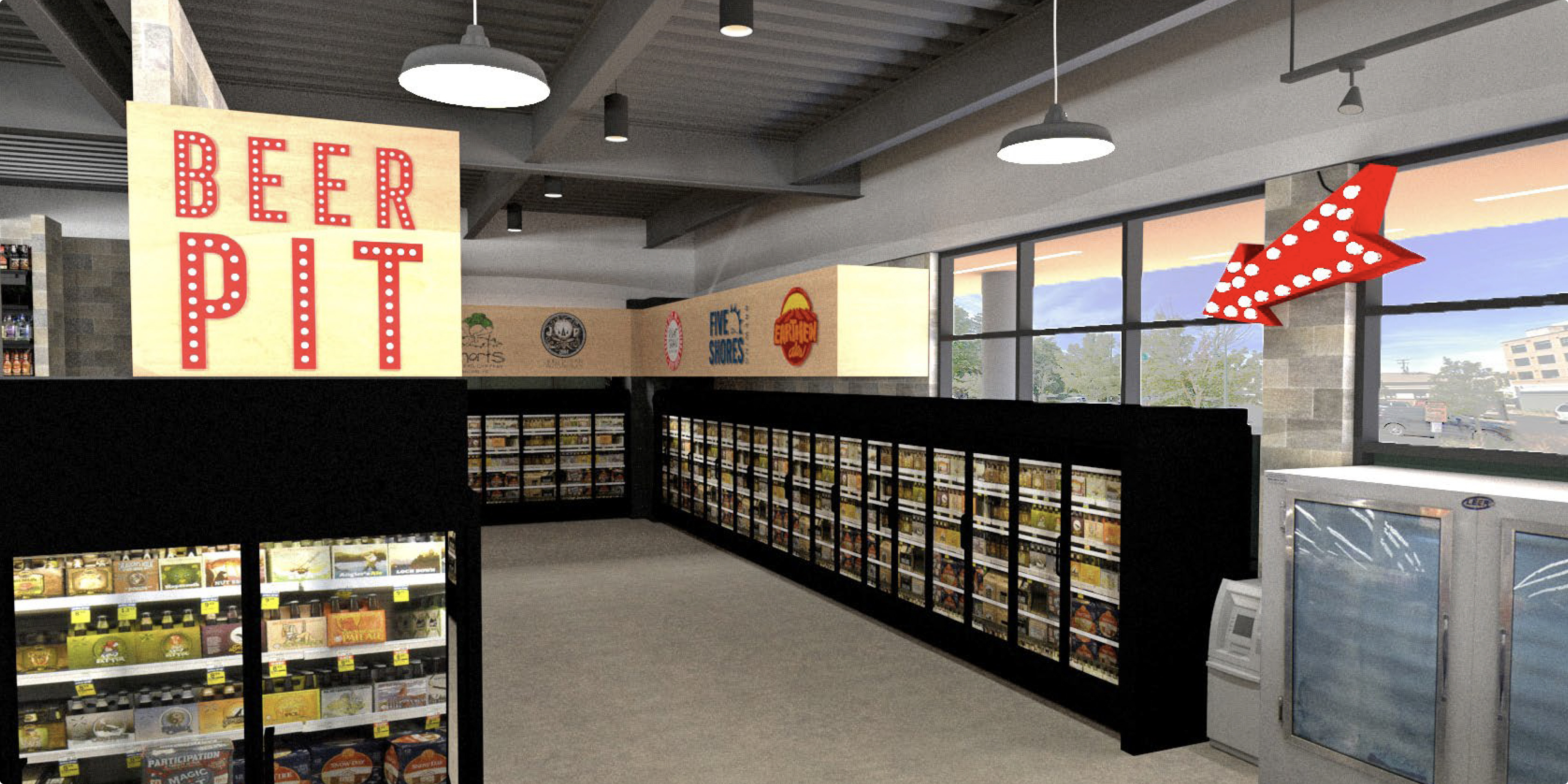
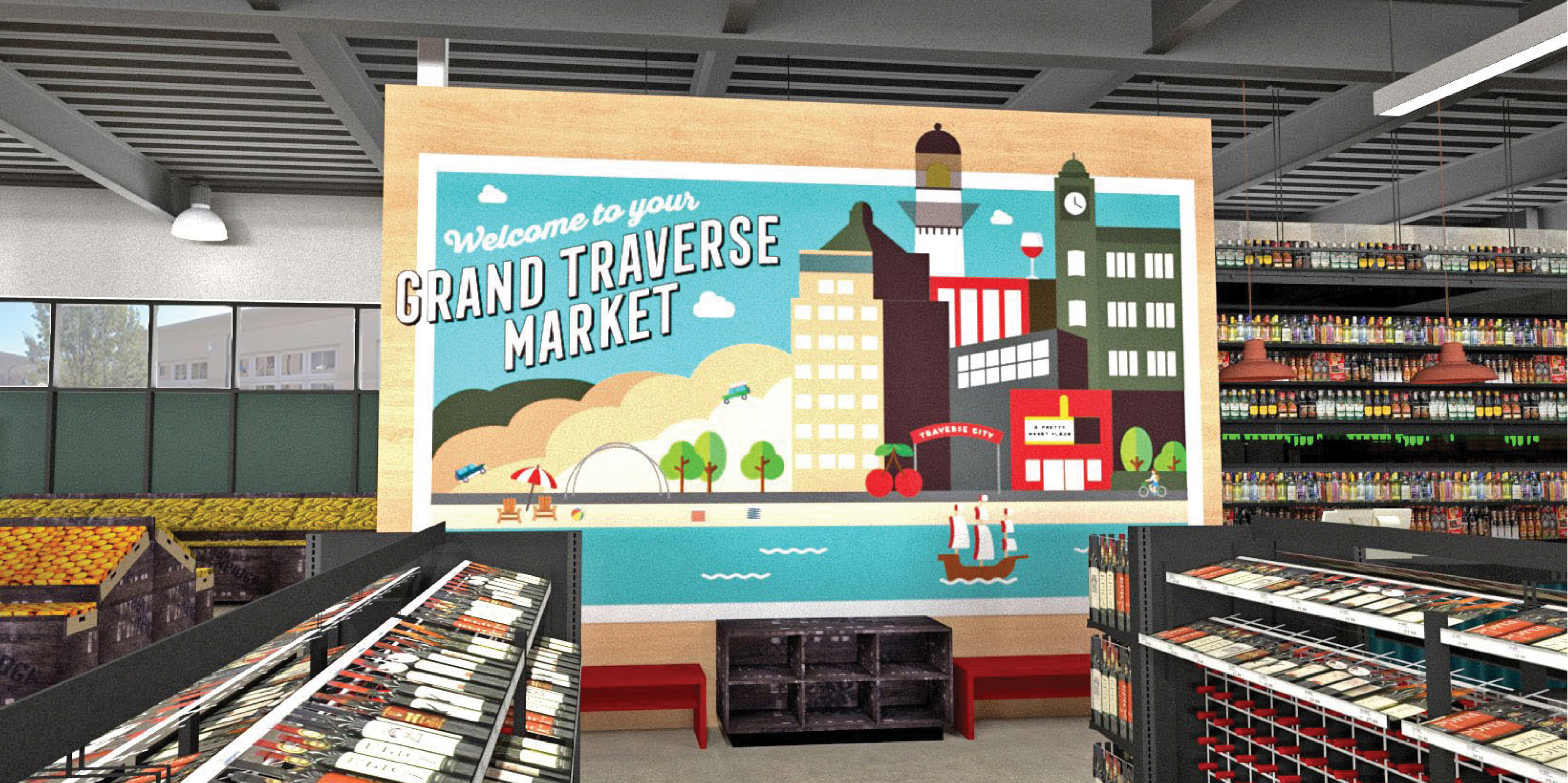
During my time as an intern with the Meijer Properties team, I was able to design and render a conceptual market format store located in Traverse City, Michigan.
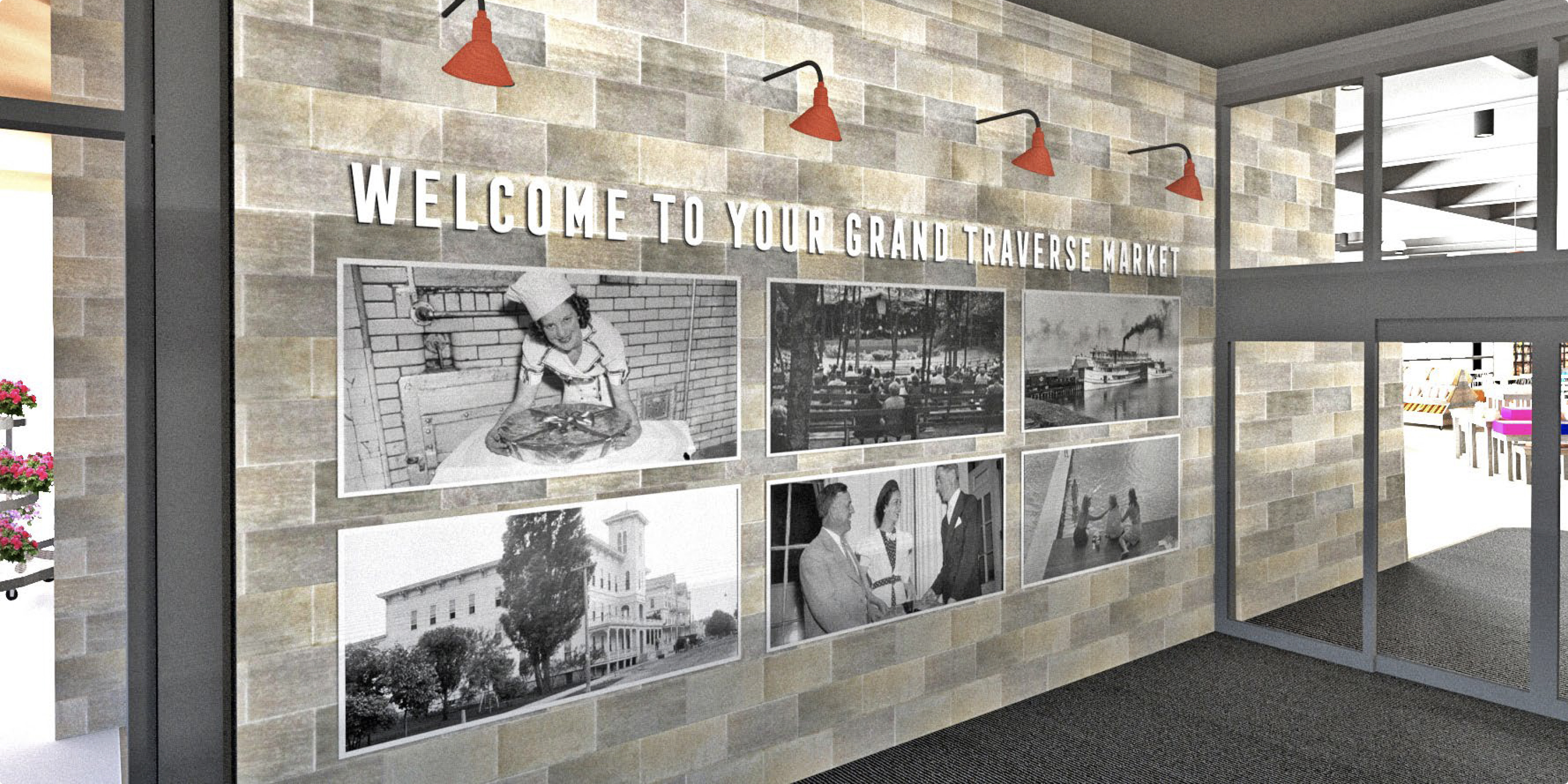
After visiting and researching the city itself, I found that Traverse City is best known for the National Cherry Festival, sailing on the Grand Traverse Bay, and the sheer amount of tourism in the area.


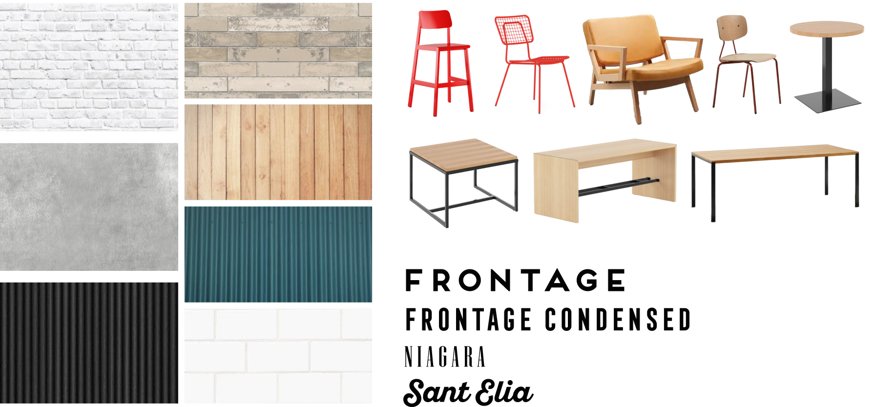
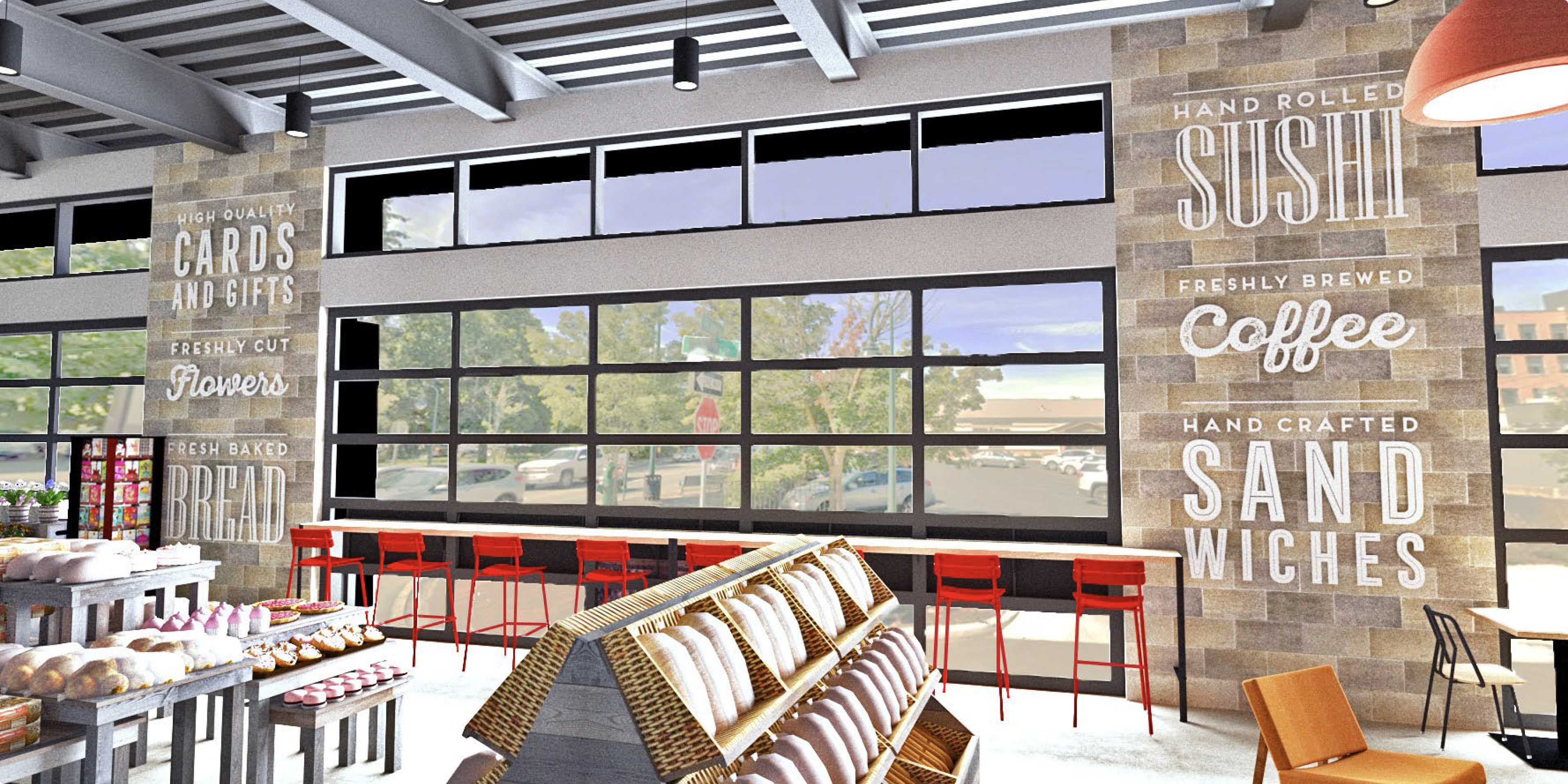
Creating a moodboard helped me find inspiration for how my research findings could translate to a designed environment.
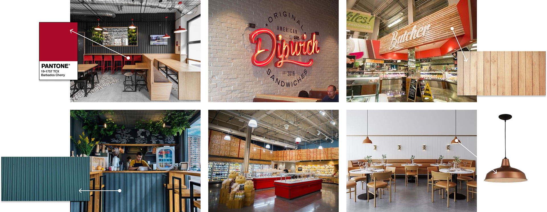
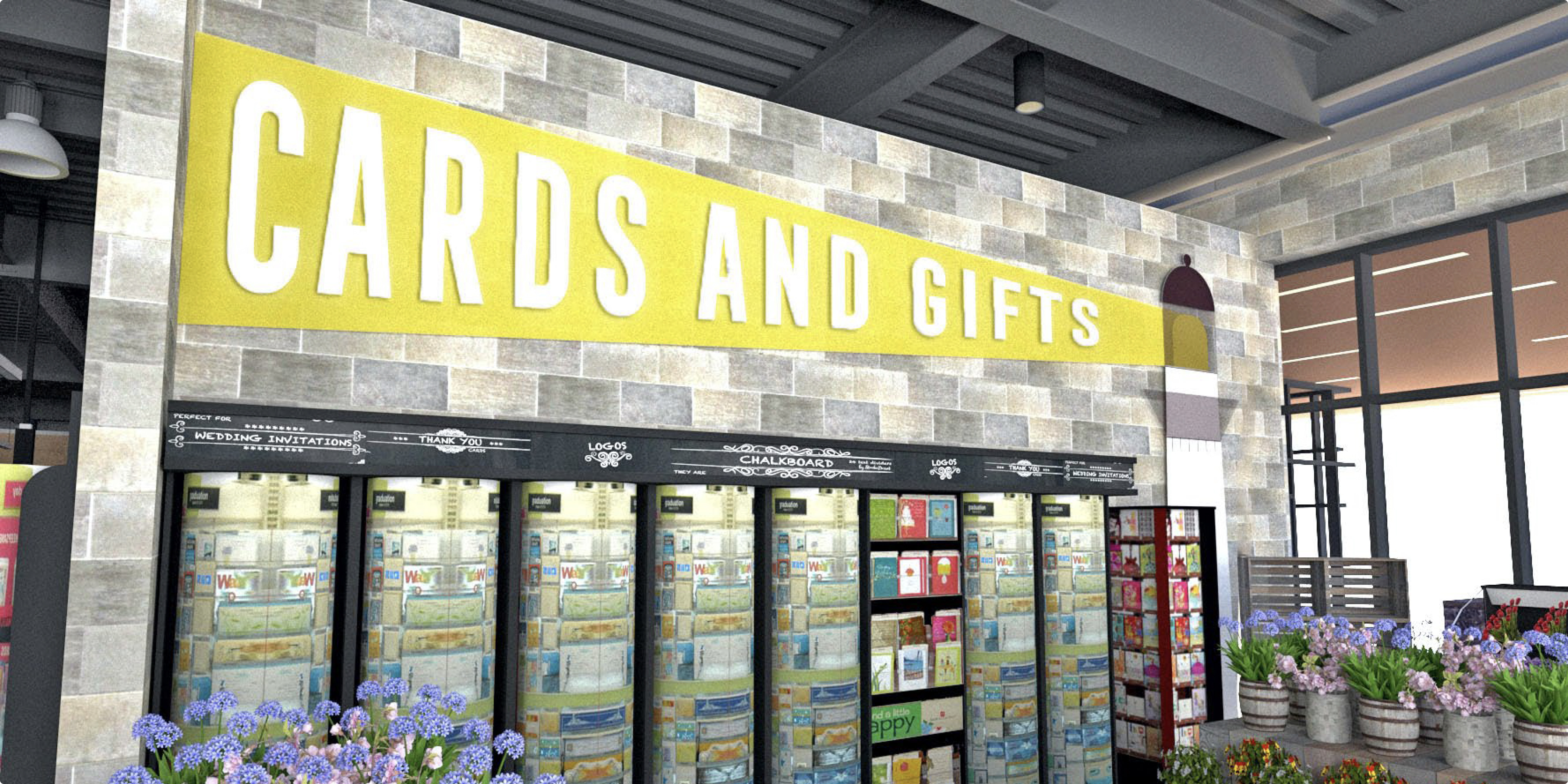
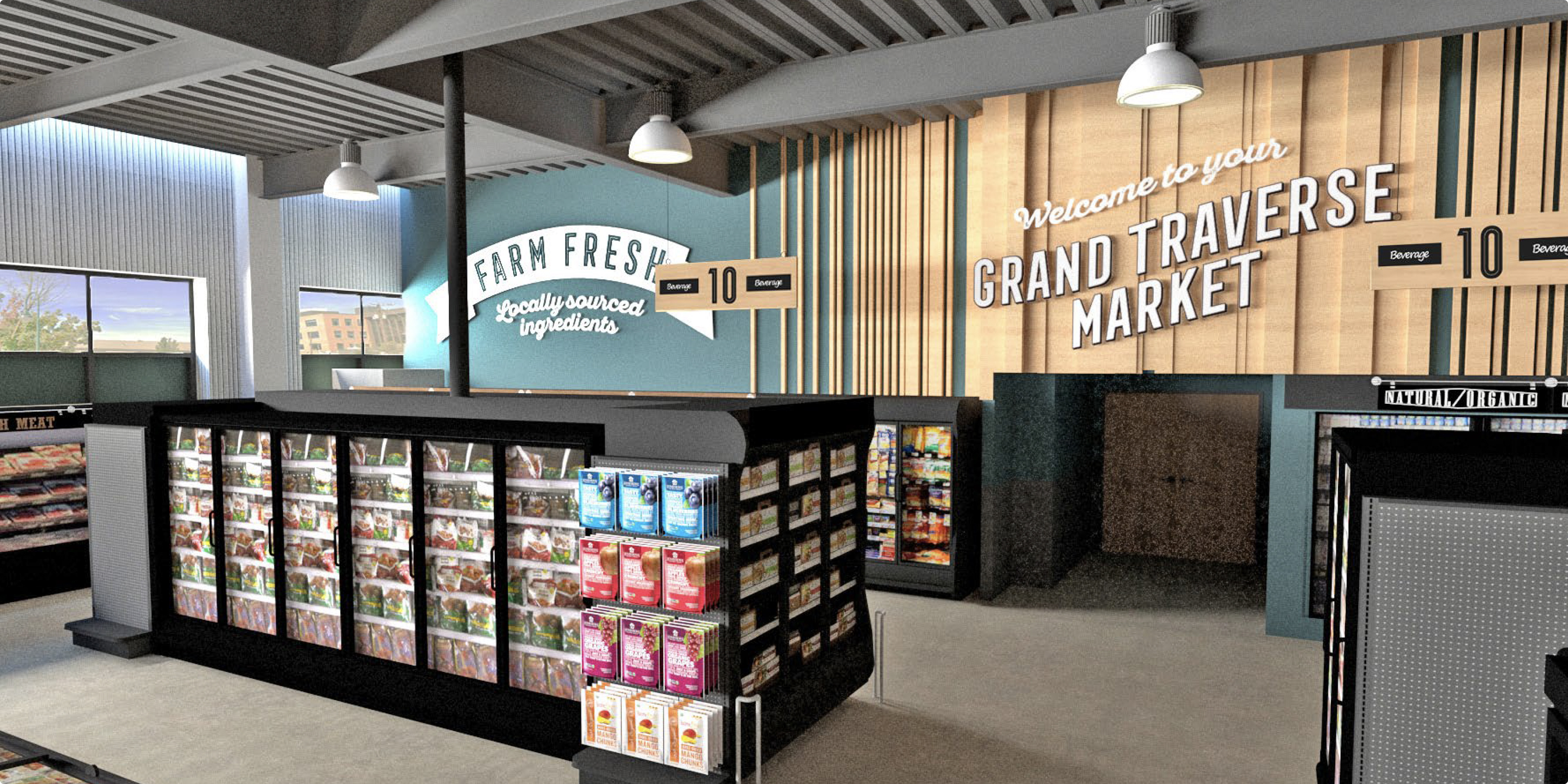
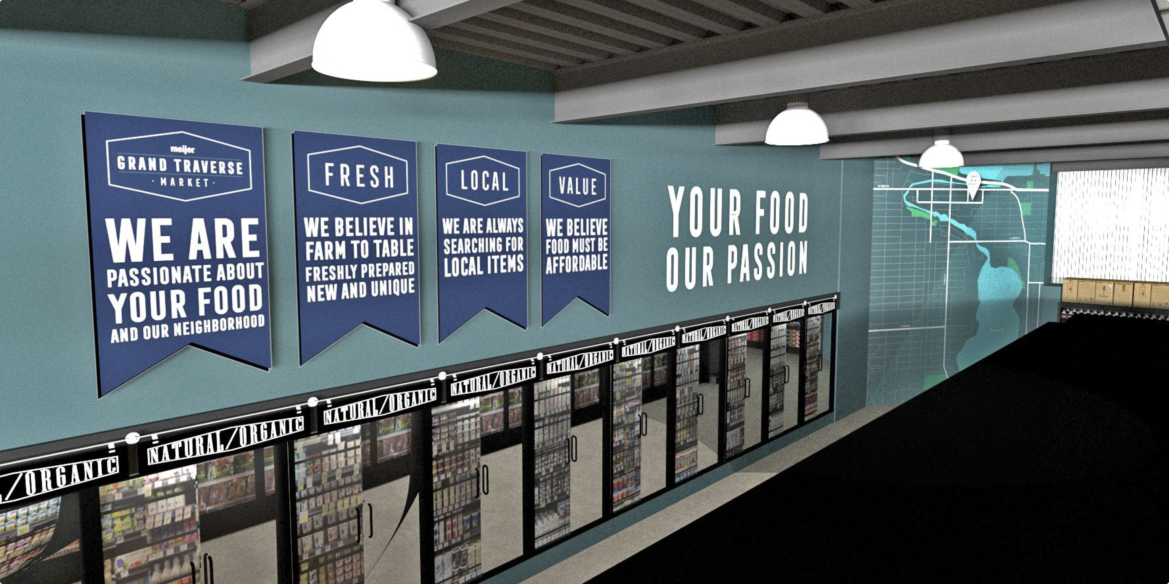
With help from the Properties team, I consolidated my ideas into a final materials, furniture, and fonts list.
Fonts were supplied by Meijer, but wall/flooring finishes and furniture were fair game to explore. I chose furniture from Grand Rapids Chair Company® to stay local and accessible.